Getting Started
SnappyFlow Dashboard
SnappyFlow dashboard is a graphical user interface that displays real-time metrics and data about the performance of an application, system, or network. The dashboard displays the data in form of charts, graphs, and alerts that provide a comprehensive view of the application performance, allowing teams to quickly identify and troubleshoot the problems.
A quick introduction
Basic Dashboard Concepts
SnappyFlow Dashboard UI
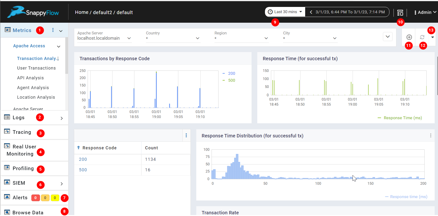
1. Metrics
Metrics are the graphical representations of the data collected from your application.
The SnappyFlow segregates the data based on the services in your application and enables you to visualize each set of data in a diagram such as a bar chart, line chart, etc...
2. Logs
Logs are the records of the events that have taken place within a system or application.
The SnappyFlow collects event information such as errors, warnings, user actions, and system activities and displays them in the dashboard UI.
3. Trace
Tracing is a process of tracking the Application programming interface (API) transactions within an application.
The SnappyFlow collects and analyzes the data such as how API requests are processed within the application, the time taken to complete each request, errors that occurred during the API request, and the dependencies between different application components. The transaction data are displayed on SnappyFlow 's dashboard UI.
4. Real User Monitoring
Real User Monitoring (RUM) collects performance data about a website or application directly from the end user's web browser or mobile device.
SnappyFlow's RUM provides insights into the user experience like page load times, page rendering time, network latency, and other factors that can impact user satisfaction. Metrics such as Response time, Transactions, Errors, Event information, and Browser information are monitored and visualized to help identify and troubleshoot website performance issues.
5. Profiling
Profiling is known as visualizing the events in your machine that are occurring now.
The SnappyFlow enables you to take a screenshot of code performance context. It also explores the memory usage and garbage collection of your application. With SnappyFlow profiling, you can identify slow or inefficient database queries, thread-locks, memory leaks, and unusual memory consumption.
6. SIEM
Security Information and Event Management (SIEM) system is designed to identify real-time security events and incidents by analyzing log data from the sources. SnappyFlow's SIEM feature collects and analyzes security-related data from various sources, including network devices, servers, applications, and security controls like firewalls and antivirus software.
Once the data is collected and analyzed, the SIEM feature assigns a severity level to each event based on its potential impact, and the events are then displayed on SnappyFlow's dashboard.
7. Alerts
Alerts are the signals triggered when the event running in the application exceeds the predefined thresholds or rules that are set by the user. When an alert is triggered SnappyFlow notifies you by sending a notification to external communication/collaboration tools like Email, Slack, Microsoft Teams, and various Incident Management tools.
8. Browse Data
<<<<<<< HEAD
Browse Data refers to the raw data collected in the SnappyFlow database. It allows the user to access the raw data by filtering the data using the following parameters as Index, Instance, Plugin, and Document type.
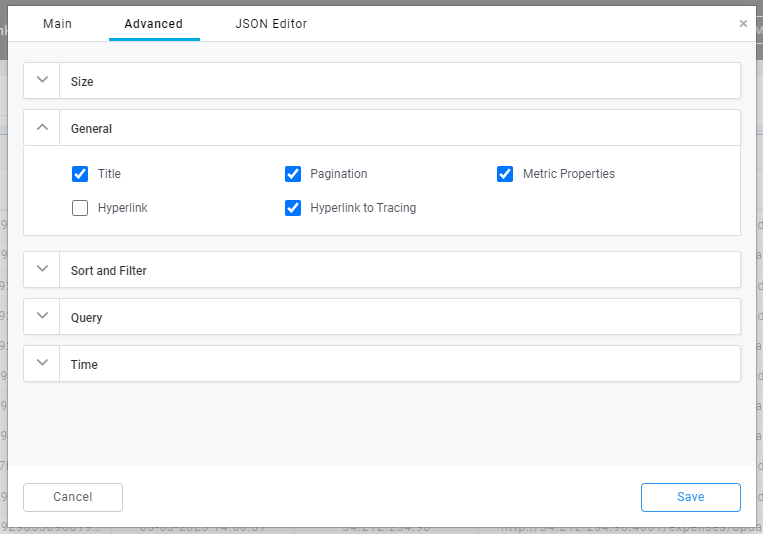
Hyperlink to Tracing
The Hyperlink to Tracing feature allows you to navigate from table to tracing page.
Follow the below steps to enable the Hyperlink to Tracing feature.
- Go to Edit Component’s advanced section and enable
Hyperlink to Tracingcheckbox, which can be found under the General category.
- In the JSON Editor tab, provide the configuration object as mentioned below in the traceHyperlink list.
{
 field:<tracing_field_name>,
 page:<tracing_page_name>,
 column:<table_column_name>
}
Example
traceHyperlink:[
    {
        field: traceId,
        page: realTime,
        column: Trace ID
    }
]
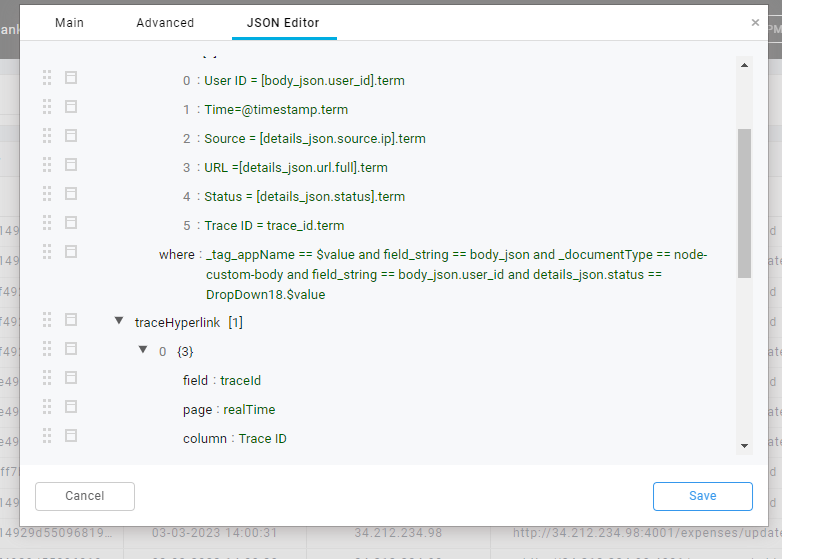
Field
The field refers to the tracing field in the tracing feature. It can be any of the following tracings fields: service, transactionType, method, resourceApi, result, status, origin, originIP, traceId, transactionId, nodeName, podName, forwardedIP.
Page
The page refers to the pages of the tracing feature. It can be any of the following pages: aggregate, realTime, history.
Column
The column refers to the column of the table to which the hyperlink will be enabled.
Generic Filter Component
origin/test
9. Timeline
The timeline feature displays the time stamp of the data points visible in the users' dashboard UI. It also allows the user to view the data in a selected time range. It helps the users to identify trends, anomalies, and patterns in the data.
10. Template
The Template is a pre-designed layout that serves as a starting point for creating a new dashboard. This can save time and effort, especially when creating multiple dashboards with similar requirements or purposes.
11. Add Component
Add Component feature in a dashboard UI allows users to customize the visualization of the dashboard by adding new components that display specific types of data or information. These components may include charts, graphs, tables, or other visual elements that can be used to represent data in various formats.
By using the Add Component feature, users can tailor the dashboard UI to their specific needs and requirements, and display the data in a way that is most meaningful to them.
12. Refresh
The Refresh option in a dashboard UI allows the user to reload or refresh the displayed data according to their requirements. By refreshing the data in the dashboard UI the user can ensure that the data is up-to-date.
13. Share
The Share feature enables users to share the dashboard by sharing a link to the dashboard UI. This can be particularly useful in situations where multiple members of the team need to be informed about the same information.
Create your first dashboard in SnappyFlow
A step-by-step guide to create a dashboard
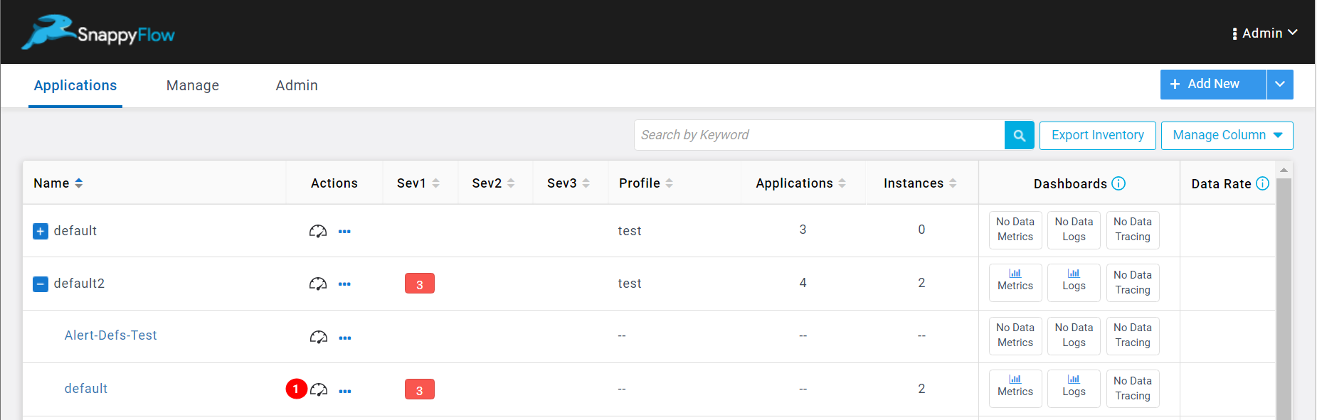
Go to the Application tab.
Navigate to Project > Application (Example: default2> default).
Click the Dashboard (1) icon.
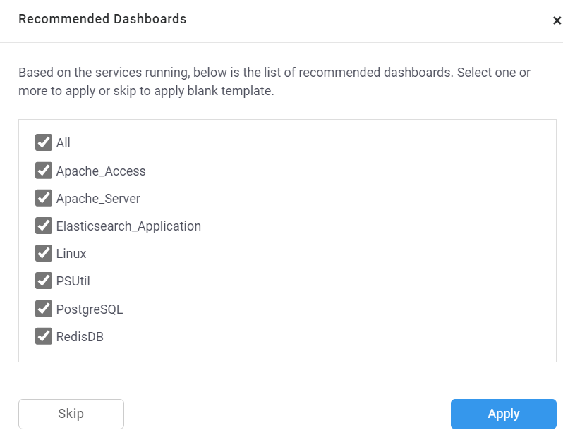
The Recommended Dashboard window will pop up.
noteThe Recommended Dashboard is a pre-designed dashboard based on the services running in your application.
Select the services as per the requirement.
Click the
Applybutton.Metrics will be generated in the dashboard based on the services running in the system.
<<<<<<< HEAD
=======
- If the field type is number, then the operators will be
>,>=,<,<=,!=,== - If the field type is text, then the operators will be
~(contains),~-(does not contain),==(equal to).origin/test